Theme: Build interactive graphics by declaring visual intent
Interactive visualization is most useful when interaction helps a reader answer a question. Altair supports this goal through a declarative grammar: instead of manually drawing marks and wiring browser events, you describe the data, transformations, encodings, selections, and relationships among views. Altair then produces a Vega-Lite specification that can be rendered in notebooks, Quarto, and web pages.
This chapter develops two coordinated analytical views from one reproducible teaching dataset. The first links a scatter plot to a time-series plot through a selection. The second uses focus and context to inspect change through time. Together they show how interaction can become part of the analytical argument rather than decoration.
Learning objectives
By the end of this chapter, you should be able to:
explain the declarative model behind Altair and Vega-Lite;
map data fields to marks, channels, scales, and guides;
transform data inside a chart specification;
add parameters for filtering, highlighting, and zooming;
compose linked views with shared selections;
design useful tooltips and accessible fallback views;
export interactive HTML and static previews reproducibly; and
recognize when interactivity adds complexity without analytical value.
From plotting commands to visual specifications
An imperative plotting workflow describes how to draw a chart: create an axis, draw points, assign colors, and register event handlers. A declarative workflow describes what the chart should represent.
Code
flowchart TD
    A["Tidy data"] --> B["Marks and encodings"]
    B --> C["Transforms and parameters"]
    C --> D["Vega-Lite specification"]
    D --> E["Interactive rendered view"]
flowchart TD
    A["Tidy data"] --> B["Marks and encodings"]
    B --> C["Transforms and parameters"]
    C --> D["Vega-Lite specification"]
    D --> E["Interactive rendered view"]
The specification is inspectable and serializable. It can be saved as JSON, embedded in HTML, versioned with the analysis, and rendered by another compatible environment. That portability is one of Altair’s strongest advantages.
Prepare the chapter dataset
The generator creates a deterministic monthly dataset for three regions. Each row contains a date, region, reach, engagement, and completion rate.
import pandas as pddata = pd.read_csv("data/processed/07-altair-observations.csv", parse_dates=["date"],)print(data.shape)print(data.head())
The table is in tidy form: one observation per row, one variable per column, and one value per cell. This structure makes fields easy to assign to visual channels.
Field
Role
Altair type
date
monthly time position
temporal
region
comparison group
nominal
reach
horizontal measure
quantitative
engagement
vertical measure
quantitative
completion_rate
bounded performance measure
quantitative
Build a chart from marks and encodings
An Altair chart begins with data and a mark. Encodings map fields to properties such as horizontal position, vertical position, color, size, and tooltip content.
The shorthand reach:Q identifies both the field and its measurement type. The common type codes are Q for quantitative, N for nominal, O for ordinal, T for temporal, and G for geographic. Explicit types make the intended interpretation visible and prevent accidental inference.
Control scales, axes, and legends
Altair chooses sensible defaults, but defaults are starting points rather than decisions. For a bounded rate, formatting the axis as a percentage communicates meaning more directly.
Truncating a quantitative scale can exaggerate differences. Here it is appropriate for a line chart concerned with changes within a limited operating range, but the domain should remain explicit. Bar charts, which encode magnitude by length, normally require a zero baseline.
Use a stable color domain and range when the same groups recur across chapters:
Altair can express filters, calculated fields, aggregates, bins, and window operations without mutating the source table. The following chart calculates the monthly mean engagement across regions:
Specification-level transforms are useful when they make the visual logic inspectable. Substantial cleaning, joins, validation, and domain calculations should still happen in pandas so they can be tested independently.
Treat parameters as analytical controls
A parameter stores a value or selection that can influence encodings, filters, and scales. This is the central mechanism for declarative interaction.
The selection records a region when a reader clicks a mark. A double-click clears the selection, and empty=True means all regions are included before a choice is made.
A control is worthwhile when its possible values support a meaningful question. Do not add widgets simply because the library makes them easy to create.
Coordinate multiple views
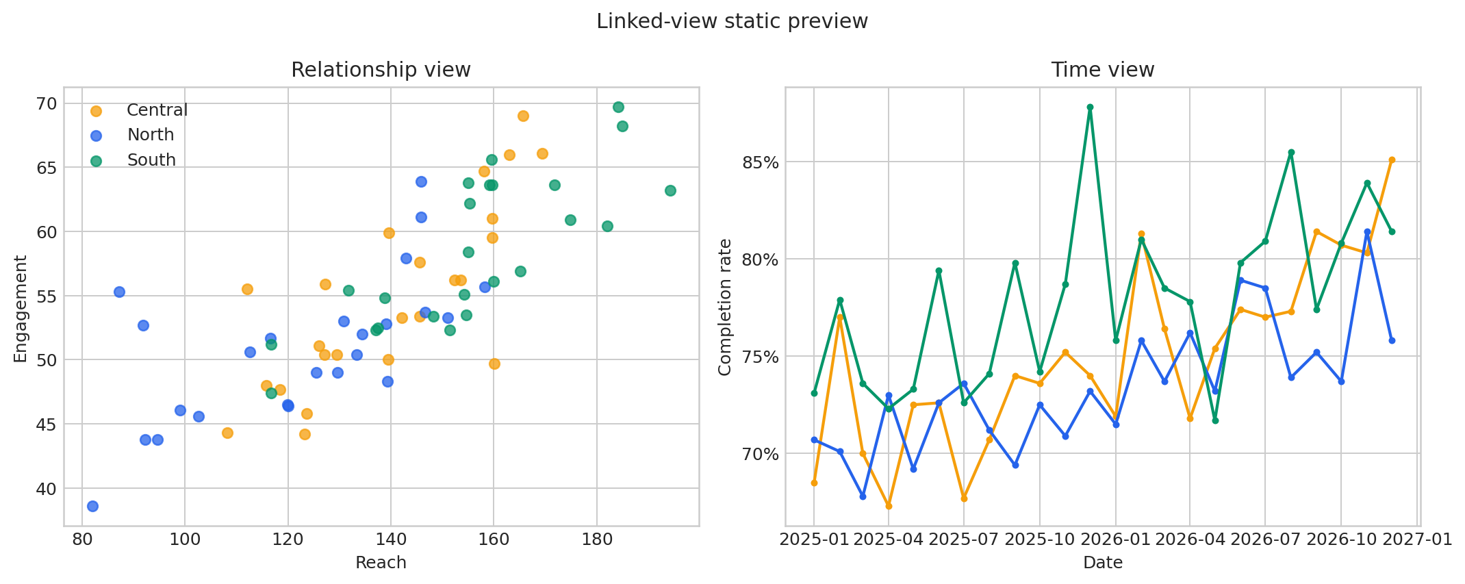
Linked views allow one selection to govern more than one chart. Here, clicking a region in the scatter plot highlights that region and filters the time-series view.
Figure 9.1: Static preview with a reach-versus-engagement scatter plot beside a completion-rate time series.
The selection performs two related jobs. It conditions the color encoding in the scatter plot and filters the trend chart. This makes the interaction itself part of the specification.
Add focus and context for temporal exploration
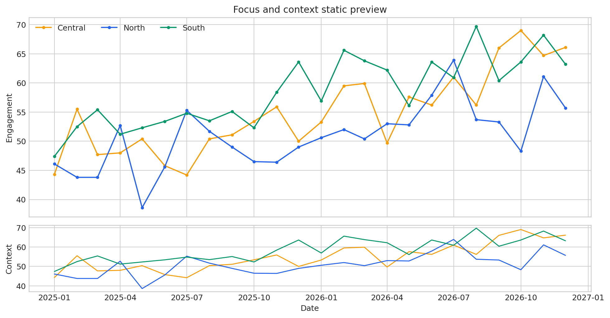
Long time series often require more detail than a fixed chart can show. A focus-and-context design preserves the overall sequence while allowing a reader to inspect a narrower window.
Figure 9.2: Static preview with a detailed engagement time series above a smaller context view.
Zoom and pan are effective when readers need to inspect dense temporal detail. They are poor substitutes for showing the important time range directly when the author already knows which period matters.
Compose charts deliberately
Altair provides several composition operators:
Composition
Python form
Best use
Layer
base + annotation
reference lines, labels, intervals
Horizontal
left | right
linked side-by-side comparisons
Vertical
top & bottom
focus and context, related sequences
Concatenate
alt.concat(...)
custom arrangements
Facet
.facet(...)
repeated small multiples by category
Repeat
.repeat(...)
systematic views over several fields
Composition should preserve a clear reading order. Share scales when direct comparison matters; keep scales independent when the measures have different meanings or ranges. Never let a shared legend imply that unrelated encodings are comparable.
Design tooltips as details on demand
Tooltips should add precise information without forcing the reader to decode raw field names.
Keep the list short, use human-readable labels, and format dates and rates explicitly. A tooltip must not be the only place where the chart communicates its main conclusion because it is invisible until interaction occurs and may be difficult to access using a keyboard or assistive technology.
Use HTML for full interaction and a PNG or SVG fallback for PDF output, repository previews, and contexts where JavaScript is disabled. The generated results/07-altair-chart-manifest.csv records both forms and their purposes.
Note
The packaged generator writes portable Vega-Lite HTML and static PNG previews from the same deterministic dataset. The chapter examples use Altair syntax directly so learners can see the Python API that produces equivalent specifications.
Accessibility and progressive disclosure
Interactivity does not automatically make a graphic accessible. Apply the following safeguards:
state the chart’s analytical message in surrounding prose;
provide a descriptive title, axis labels, legend title, and figure caption;
avoid using color as the only selection cue;
retain adequate contrast for selected and unselected marks;
make the unselected state informative;
provide a table or static image when hover is essential;
keep instructions close to the chart; and
test the output at narrow viewport widths and with keyboard navigation.
Progressive disclosure is valuable when the overview remains meaningful and interaction reveals secondary detail. It fails when readers must explore blindly before they can understand the basic result.
Performance and data volume
Altair embeds chart data into a specification unless a different data transformer or URL is used. Very large datasets can create heavy HTML files and slow browser rendering.
For large data:
aggregate to the level required by the visual question;
filter irrelevant fields and rows before chart construction;
consider sampling for dense point clouds;
store data externally when deployment conditions allow it; and
use a server-backed tool when interaction requires querying millions of records.
Aggregation is not merely a performance trick. It changes the unit represented by each mark, so document it clearly.
Common failure modes
Failure
Why it matters
Better approach
Every channel is interactive
Readers cannot identify the intended action
Choose one primary interaction
Hover carries the conclusion
Touch, keyboard, and static readers may miss it
Put the main message in visible annotations and prose
The HTML files require an internet connection when opened because their compact wrappers load the Vega, Vega-Lite, and Vega-Embed JavaScript libraries from a content delivery network. A production deployment can vendor those libraries locally when offline operation is required.
Exercise: build a threshold explorer
Create a slider that filters observations below a chosen completion rate. Then link the filtered points to a monthly trend.
Requirements:
bind a parameter to a slider ranging from 50% to 90%;
Before publishing an Altair visualization, confirm that:
CDI Insight
Declarative interactivity is powerful because it turns interaction into an explicit relationship among data, encodings, and views. The goal is not to make readers work harder. It is to let them test a focused question while preserving the evidence and context needed to interpret the answer.